A developer-ready design system behind a 20% conversion rate

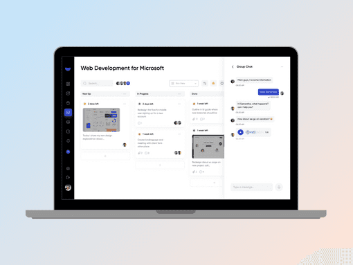
In-house product work. We designed a modern UI and UX in Figma covering the admin dashboard and internal pages, ready for engineering.

Conversion Rate
20%
Engagement
95%
Client
Andtask (in-house product work)
Industry
Project management software
Services
Web Design & Development
Andtask Project management software project cover image

Context

The context behind this work

This is in-house product work, not a client engagement. Brand Yatra is a unit of Andtask Private Limited, so the design team and the product team sit inside the same company. That changes the record we can share. There is no external brief and no client sign-off to describe, and we have written this as what we built and why.

Design systems for data-heavy internal tooling behave differently from design systems for marketing sites. A marketing site has a small number of pages, each one deliberately distinct, and a visitor sees maybe three of them. Internal tooling has hundreds of screens and the same person uses them every day. Distinctiveness stops being useful. Predictability takes over as the thing that matters, because a user who has learned one table has learned all of them.

Consistency also compounds in a way it does not on a site. Every screen built on a shared component inherits its improvements and its faults. Get a table right once and every table in the product is right. Leave a component ambiguous and that ambiguity is copied into every screen that uses it. Ambiguity in Figma becomes inconsistency in the build, and inconsistency in the build becomes support tickets and rework later.

The challenge

A full platform to design, not a handful of screens

Andtask needed a production-ready design system for an entire project management platform. Not a landing page, not a concept deck. The scope covered admin, dashboards and internal tooling.

Data-heavy screens carry problems that mockups tend to hide. A dashboard looks clean with six rows of tidy sample data and behaves differently with six hundred rows, long project names, missing values and three filters applied. Designs that only exist in the ideal case get resolved by whoever builds them, and every developer resolves them differently.

Consistency mattered more than novelty. Every surface had to feel like part of the same product and behave predictably, so a user moving between admin and dashboard would not have to relearn how anything works.

It also had to be handed to engineering without a translation layer. Anything left unstated in Figma becomes a decision made under time pressure during the build, and those decisions are the ones that drift.

What was at stake

  • Inconsistent internal surfaces would slow every future feature.
  • Engineering time would be spent interpreting designs instead of building.
  • Core flows carried the product's conversion and retention.
  • Every unresolved edge case would resurface as rework after launch.

The work

How we approached it

01

Information architecture

Map every internal surface before drawing a single screen.

Screens come last. Before any of them exist, the platform needs a model of what it contains and how those parts relate. We listed every surface across admin, dashboard and internal tooling, then grouped them by the task a user is trying to complete rather than by the database object behind them. Those two groupings look similar and are not the same, and following the data model instead of the task is how products end up with navigation that only makes sense to the people who built the schema. From there we defined hierarchy and navigation, worked out what belongs at the top level and what sits one layer down, and checked the structure against real task flows. Doing this first means a screen is a place in a structure rather than a picture, and the structure holds when features get added.

  • Structured admin, dashboard and internal tooling areas
  • Grouped surfaces by user task rather than by data object
  • Defined navigation and hierarchy across the platform
  • Checked the structure against real task flows before design
02

Modular component library

Build reusable parts so screens stay consistent as the product grows.

A component is only finished when its states and variants are defined. Default is the easy one. The rest is where the work sits. Hover, focus, active, disabled, loading, error, selected, read only, and each of those in every size and density the product needs. We designed the library in Figma with those states explicit rather than implied, because a state that is not drawn is a state a developer invents. Variants were kept to combinations the product actually uses, since a library that offers every theoretical permutation is harder to use than one with clear choices. Everything was then tested against realistic data instead of neat placeholder content. Long project names, wide numbers, unusual character counts, dense tables. Components that only hold together with short strings do not survive contact with a real database, and it is cheaper to find that in Figma than in review.

  • Designed a modular component library in Figma
  • Defined every state explicitly rather than leaving it implied
  • Limited variants to combinations the product actually uses
  • Tested components against realistic data, not placeholder content
03

Edge cases and interaction patterns

Resolve the conditions that usually get decided during the build.

Most inconsistency in a shipped product traces back to a handful of conditions nobody designed. Empty states are the first. A table with no rows is a screen a user will meet on their first day, and if it has not been designed they meet a blank rectangle. Long strings are the second, because names, titles and descriptions in real use are longer than anything in a mockup, and truncation rules have to be decided somewhere. Then error conditions, loading states, partial data, permission-restricted views and what happens when a request fails halfway through. We designed each of these once, at the component level, so every screen inherits the same behaviour. Interaction patterns were defined the same way. One rule for how a shared component responds, applied everywhere, rather than a decision made per screen.

  • Designed empty, loading, error and partial data states
  • Set truncation and overflow rules for long strings
  • Defined interaction patterns once at the component level
  • Resolved permission-restricted and failed request views
04

Engineering handoff

Hand over files a developer can build from directly.

A handoff is developer-ready when a build decision does not require a conversation. That means naming in Figma matching the naming engineering will use, so a component in the file maps to a component in the codebase without a lookup. It means spacing, sizing and colour coming from defined tokens rather than arbitrary values a developer has to measure. It means states shown rather than described, so nobody is inferring behaviour from a note. And it means the responsive intent being explicit, showing how a dense table behaves as the viewport narrows instead of leaving it to be worked out. We prepared the files that way across the full admin and internal page set, and kept structure consistent with the component library so the file and the build stayed in the same shape.

  • Prepared developer-ready Figma files
  • Matched naming and structure to the component library
  • Used defined tokens for spacing, sizing and colour
  • Made responsive behaviour explicit for dense screens

What we shipped

  • Modular component library in FigmaComponents with every state and variant defined explicitly, tested against realistic data rather than placeholder content.
  • Information architecture for the full platformEvery admin, dashboard and internal surface mapped and grouped by user task, with navigation and hierarchy defined.
  • Admin dashboard and internal page designsThe full internal page set designed on the shared system, including dense table and dashboard layouts.
  • Edge case and interaction pattern setEmpty, loading, error and partial data states, truncation rules and shared interaction behaviour, defined once at component level.
  • Developer-ready handoff filesToken-based spacing and colour, naming aligned to the codebase, states shown rather than described and responsive intent made explicit.

Outcome

Results

Conversion Rate
20%

Conversion on the core flows built from the design system.

Engagement
95%

Engagement across the platform's core product flows.

The design shipped as the foundation of the platform, with strong conversion and engagement on the core flows. Because the system was modular, later surfaces inherited the same patterns instead of drifting. The compounding effect is the part worth noting. Each new screen started from resolved components rather than from a blank frame, so build time fell as coverage grew.

How we work

What we hold to on this kind of work

Structure before screens

Information architecture comes first. A screen designed without a model of the product is a picture, and pictures do not survive the next three features.

A state that is not drawn is a state invented

Empty, loading, error and overflow conditions get decided by someone. Better in Figma once than in the build repeatedly.

Design against real data

Placeholder content flatters a layout. Long strings, wide numbers and dense tables are the honest test, and they are cheap to run early.

Want results like these?

Send us your goals and we will reply within one business day with the first three moves we would make.

Questions

Frequently asked

Explore the design files

More case studies

Get a plan for your brand

Tell us where you are stuck. We come back within one business day with the first three moves we would make.

We reply within 24 hours.0/1000

Certified partners

Meta certified partner badgeGoogle certified partner badgeSnapchat certified partner badgeShopify certified partner badge
No obligationReply within one business dayNDA on request

Prefer to talk first? Book a call